
Pop-ups? What!

Do we want to be winding someone up? Well of course not! That is not what pop-ups are for.
Annoying! As they truly mostly are! Certainly, nobody wants pop-ups.
But Hey! There is always a way to make things sound super cool and easy to go about.
Yes, a review on Shopify says how amazingly pop-ups work in following terms:
In one test, popups drove 1,375% more email captures vs. a sidebar opt-in form.
In another test, a website was receiving only 10 to 15 subscribers per day despite getting over 44,000 unique visitors each day. After implementing a popup with a 60 second delay, they began receiving 100-150 emails per day.
This really shows us that Pop-ups are meant to drive more business but somewhere we all need to know following pop-up tips so that our visitors are not bemoaned because of pop-ups.
12 Things You Are Missing in Your Website Pop-Up
1. Color Combination
Pop-up has to be eye-catching but please let it be bearable too. Graphics and UI can generate more leads, hence we should pay careful attention to the quality of the same. The color of the background and the pop-up color should either match or perfectly contrast each other.
Yes! An ideal color combination is a first thing you have to look at in case you are missing it from your website pop up.
2. Long Forms
Hey Stranger! You tell me your name and you see I am going to be the best thing ever happened to you.
Oh really? This only happens in the movies that strangers get along with each other on the very first go.
In reality? Not likely to happen! My point is if your pop-up forms are long then people are spending way too much time filling them out. A simple thing as asking their email ID would be enough but don’t miss to explain the reason why you want such information.
3. Irrelevancy
A: Hey, I am Neil and what is your name?
B: Oh, Hello Neil! My name is Cecilia & I have a sister. Her name is Sally J
(A: Ugh! Why Sally? Who Sally? Sally – I didn’t ask for)
That’s what irrelevancy is. This is also irrelevancy if a male visitor browsing for ties is shown a pop-up for women’s scarves. Doesn’t make sense, does it? This is when you know relevancy is what you are missing in your website pop-ups.
4. A lot of information
Making very lengthy pop-up text gets no benefit. The summary of what you are offering cannot bring many benefits as you might think it would. Only explaining what exactly you are offering most likely gives you the expected result and thus it has to be limited to around 10 words.
5. Wrong Timing
Every pop-up has to be shown at a different timing depending upon its type. Exit intent pop-up as explained below should be at the end of the page when a visitor is about to leave your page whereas Scroll Intent pop-up comes when you scroll after you have explained enough about what you are offering.
6. Give them an idea with a demo or a Trial Period
When I read Netflix is giving a month’s free subscription to it’s streaming, I started to list in my mind the programs I wouldn’t have watched unless Netflix hadn’t offered this & this gave Netflix an opportunity to explain to me how reasonable their charges are & I felt I could afford.
Do you see how readiness is triggered about a thing which I wouldn’t have thought otherwise? Let people know your reasonableness and they’ll become your marketing leads & soon you’ll see sales growth.
Free demos or trial periods are necessary pop-ups to embed in your website pages. So, be quick & examine your strategies if you are missing that in your website pop-up lists.
7. Just how many pop-ups would you embed?
What if you embed too many pop-ups on a single page and the visitor is just too displeased that they leave all your page, all your offers and products, and services. Better to go for 2 pop-ups.

Please don’t make them hate everything.
8. Target your Pop-Ups
Once you ask ‘Will you MARRY me?’ and you get an answer and it is YES.
Yessss!
Then next thing that you do is go and start marriage preparations and not go and ask the same thing again.
You are right! You wouldn’t do such a thing and I can’t imagine you losing such a chance.
Similarly, once the visitor has subscribed and has become a regular customer it is not very intelligent to ask them to subscribe again with a wrong pop-up.
9. No Exit
It is no good sign to force on our visitors and thus pop-ups should be closable with ‘No, Thanks’ or Cross button in the top-right corner.

10. Limited Time Offer
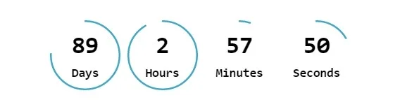
We are often tempted to go buy during monsoon and year-end sales season because we know that ends so soon before we think, decide and then Go! Human psychology plays a great role here. The fact that we make it urgent have that offer, people giving buying a priority. Of course, limited time isn’t ever as long as 89 days as mentioned in the above figure.
11. A/B Testing
What is A/B Testing?
Optinmonster defines it this way - A split test (or A/B test) is a test that marketers run to compare two different versions of a web page or popup to find out which one converts visitors the best.
Why then we use A/B testing? To know which pop-up to go about!
12. Last and most important - Exit Intent
Lastly, you can design the Exit Intent pop-up as an option. It is wise to give the visitor an idea of relevant products or services; some bait to keep them crawling-browsing for longer than they would have.

Remember the statistics mentioned in the beginning? It is good to remember pop-up is a good idea, but every wrong pop-up makes you lose a huge amount of leads you might never be getting back. So let us focus on above mentioned 12 things you shouldn’t be missing in your website pop-up.


About Vikas Bhatt
With 10+ years of B2B Lead Generation, Vikas Bhatt now runs https://only-b2b.com, a reputed B2B Demand and Lead Generation company from India that serves most European nations, the US, Mexico, and Canada. Vikas is a renowned Demand Generation expert, motivational speaker, and a B2B entrepreneur.
You can connect with Vikas over email: vikas.bhatt@only-b2b.com